This is part 3 of a three-part series describing text processing and classification. Part 1 covers input data preparation and neural network construction, part 2 adds a variety of quality metrics, and part 3 visualizes the results.
Contents
The output of our algorithm is a probability distribution based on the softmax function. We specified 14 different categories, so it has 14 dimensions, each containing a number from [0,1], whose values sum to 1. To “classify” a particular entry we simply take the largest probability but our dataset is richer than that.
Visualizing the output of a model can deliver a lot more insight than just “right” or “wrong”. We can see how different classes are related, what datapoints get classified incorrectly, and why that might be. We can see which classes are similar to each other, and which are completely different. In this post, we’ll look at a few different visualization methods.
Full code described in this entry available on GitHub, in dbpedia_classify/tree/part3.
Prerequisites
In addition to the pre-requisites from part 1 and part 2, scikit-learn
Correlation
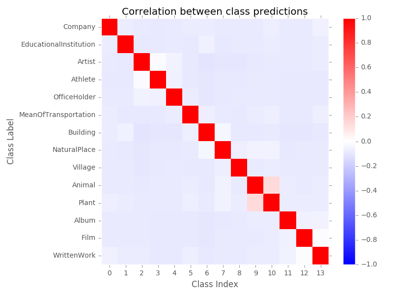
To start with, we simply check the pairwise correlations of each output dimension. In the same way that people will sometimes get confused between a red-delicious and a macintosh apple, but never between a red-delicious apple and an elephant, we can get some idea of which categories are similar by whether the output probabilities are correlated (positively or negatively).
Not an incredibly interesting graphic. I set the scale from [-1.0, +1.0] just to give full scale. Classes are self-correlated (as they must be by definition) but there isn’t a whole lot of cross-correlation between classes. Most classes are very slightly anti-correlated (-0.05 to -0.1), which we would expect by chance considering that normalization requires that when one class increases another decreases. The “Artist” and “Athlete” class are correlated near zero which is slightly above background, likely just due to being different kinds of people.
The only significant correlation is between plants and animals, at 0.14. These categories all use latin genus-species names, and the descriptions will typically involve the habitat. Animals may also be listed by what plants they eat, and plants listed by how they are involved with animals.
t-Distributed Stochastic Neighbor Embedding
A much more sophisticated method, t-Distributed Stochastic Neighbor Embedding (t-SNE)[1] creates a low (ie 2 or 3) dimensional visualization of data in a high-dimensional space by treating the points as instances of random variables and minimizing the inferred probability distribution between high and low space. It has only one free parameter, the “perplexity”, which can be thought of as “comparable with the number of nearest neighbors k that is employed in many manifold learners”[1]. We use the tSNE implementation in scikit-learn.
One drawback of tSNE is that one can’t really project new points onto the old space like we can with PCA. So I included artificial data points with probabilities set at (1,0,0,….), (0,1,0,0,…) and so on; essentially what we get with a single class having probability 1 and other classes having probability 0. These points are labelled “#_tSNE”, where “#” is the class index. I also averaged all the points together and labelled that “#_Avg”.
The hard part is all done in scikit:
from sklearn.manifold import TSNE tsne = TSNE(perplexity=perplexity, n_components=2, init='pca', n_iter=5000, random_state=2157) low_dim_embeds = tsne.fit_transform(plot_data_points) |
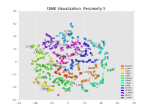
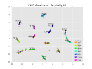
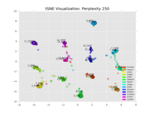
We visualize 1,000 points with varying perplexity values below.
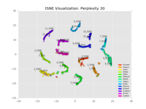
Perhaps counter-intuitively, increasing the perplexity decreases the size of the clusters. I believe what’s happening is that the perplexity refers to how many points the algorithm considers in its distance calculation, with any others ignored[2]. So a higher perplexity brings far-away points into considering. It also increases the runtime. Personally I like the results best with perplexity=30, decent looking clusters which are clearly separable.
We also notice that the average and projected-from-maximum are completely different. Looking at the perplexity=30 plot, the clusters seem to fall into lines, with the projected-from-maximum point at one extreme. 7_tSNE and 6_tSNE are at completely opposite ends of a single line (class 6=”Building”, class 7=”Natural Place”), showing both similarity and difference.
Looking at a few points which are in the middle of the class 6/class 7 continuum:
Building (class 6): “Tippecanoe Battlefield Park”. “The Tippecanoe Battlefield Park preserves the location of the Battle of Tippecanoe fought on November 7 1811.The 16-acre (6.5 ha) site of the battle was deeded to the State of Indiana by John Tipton a veteran of the fight on November 7 1836 the twenty-fifth anniversary of the battle.”
Natural Place (class 7): “Pillow Ridge”. “Pillow Ridge is a ridge of the Tahltan Highland in northern British Columbia Canada located southeast of Telegraph Creek. It extends northwest from Mount Edziza in Mount Edziza Provincial Park.”
Both items have the word “park” in the description, plus other locations (Indiana, Mount Edziza). So treating them similarly makes sense.
Interactive Visualization
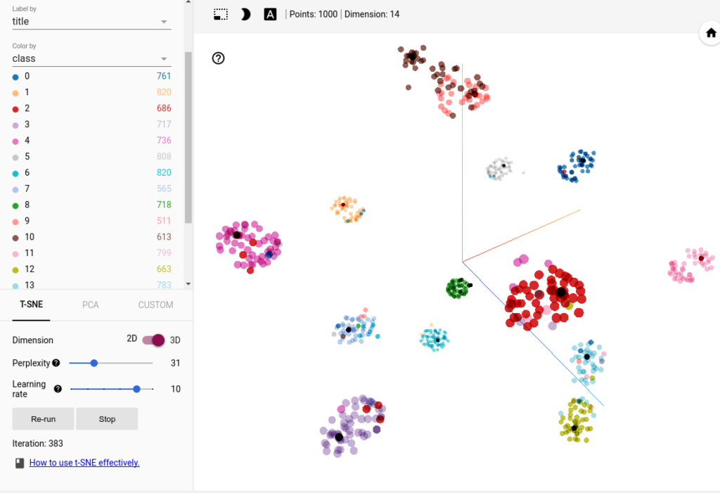
With TensorBoard, we can even make interactive projections. The “embeddings” functionality was clearly designed for word embeddings, here we are going to use it for the predictive output. tSNE is tSNE after all.
from tensorflow.contrib.tensorboard.plugins import projector # Note: Must be very consistent in naming, checkpoint file has to be named the same thing as tensor (I think) pred_probs = tf.Variable(pred_res, name='pred_probs') metadata_path = os.path.join(log_dir, 'metadata.tsv') metadata_cols = ['title', 'class'] with open(metadata_path, 'w') as met_fi: met_fi.write('%s\n' % '\t'.join(metadata_cols)) for rn in range(act_res.shape[0]): cur_col = [all_titles[rn], '%d' % act_res[rn]] met_fi.write('%s\n' % '\t'.join(cur_col)) config = projector.ProjectorConfig() embedding = config.embeddings.add() embedding.tensor_name = pred_probs.name embedding.metadata_path = metadata_path # Use the same LOG_DIR where you stored your checkpoint. init_op = tf.variables_initializer([pred_probs]) with tf.Session() as sess: sess.run(init_op) saver = tf.train.Saver({'pred_probs': pred_probs}) saver.save(sess, os.path.join(log_dir, "pred_probs.ckpt")) summary_writer = tf.summary.FileWriter(log_dir) # The next line writes a projector_config.pbtxt in the LOG_DIR. TensorBoard will # read this file during startup. projector.visualize_embeddings(summary_writer, config) |
We create a Variable to store the predictive output, and store our predicted results (pred_res) in it. The metadata export is so we label each point with its associated class and color code the resulting projection. We add the “embedding” using a Projector, and presto!
This view is available under the “embeddings” tab once TensorBoard has been launched. We can even tune the perplexity to our liking, save a particular view, and restore it! I enjoy these 3-D interactive plots immensely, they don’t make for good tutorials but they’re extremely handy for data exploration. The interactive nature means we can zoom, rotate, pan, and selectively label points (on hover or whatever) which a static plot can’t do.
The above screenshot is based on tSNE mapping, TensorBoard also includes the more traditional (and efficient) PCA. The biggest drawback to tSNE is that it’s very slow, the reason I’m only using 1,000 points here is because using more was extremely inconvenient for TensorBoard and tSNE.
Even so, I don’t know if I can go back to PCA. The quality of the visualization is just so much better. Methods are being developed to make tSNE even more efficient[3]. When those are implemented, I’ll have the best of both worlds.
Conclusion
The initial development speed and simplicity of Keras became a hindrance once we tried to exceed its intended use-cases, but generally I’d say it was a big win. In particular once the Keras API becomes integrated with Tensorflow the whole process will get a lot smoother. In this series, we’ve constructed a fairly accurate text classifier pre-trained word vectors and a mixed convolutional/recurrent neural network. We visualized the results from a binary-classification accuracy standpoint, as well as relationships between the different classes using simple correlations and stochastic neighbor embedding.
-Jacob

