A) Beware of The Wrong Summary Statistics
SlateStarCodex had a pretty interesting post entitle “Beware of Summary Statistics“, showing how they can be misleading. This isn’t exactly new, there are famous examples of how just looking at the mean and standard deviation greatly oversimplifies; distributions can have the exact same mean/stdev. but be very different[1]. The main lesson to take-away is to always visualize your data.
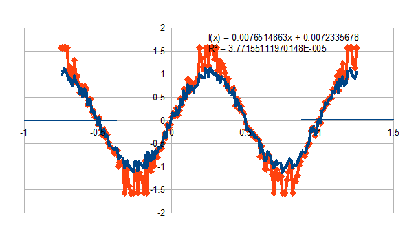
If you know the distribution in question, though, there is probably a good summary statistic for it. The go-to in social science is pearson correlation. SSC gave an example of two variables which appeared to be correlated but that correlation was highly misleading. Here are two “uncorrelated” variables:
The linear fit shows that X and Y are uncorrelated. The pearson correlation is nearly 0. However that is obviously BS as there is a clear trend, just not linear, which is what pearson correlation captures. With the benefit of viewing the data[2], we can correlate Y vs inverse-sin(Y) (orange). That correlation is 0.99. The real relationship is Y= Asin(fX), where A = 1 and f = 1. A mean/standard deviation for this would be meaningless, but amplitude/frequency would describe it perfectly.
Of course this is a rigged example, and I generated the data from a sine wave. In a real-world example, one sometimes knows (has some idea) what shape the distribution will be. If one doesn’t, visualize it and figure it out.
B) Exact Wording Matters
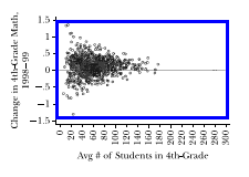
The most famous example I know of is an old study by the Gates Foundation showing that the best schools are small schools. So obviously we need to look at small schools and see why they’re so great, right? Well, no, because the worst schools are also small schools. Small school -> small sample size -> high variance, meaning the outliers are always going to be found in smaller sample sizes:
Source: The Promise and Pitfalls of Using Imprecise School Accountability Measures
Thomas J. Kane and Douglas O. Staiger.[3]
One of the earliest papers on cognitive biases looked at this[4], they asked people if large hospitals or small hospitals are more likely to have more days where >60% of babies born on that day were male. Most people said the same, because the odds of being born male are the same for any particular baby in either case. But pay closer attention to that wording; it wasn’t about the overall average, it was about the variance. Simpler example: If you flip two quarters at a time, occasionally they’ll all (re: both) come out heads. If you flip 10 quarters at a time, very rarely will they all be heads.
C) Confounders and Conditional (In)dependence
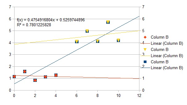
I love Simpson’s Paradox . Trends which exist in aggregated data can reverse direction when data is broken into subgroups. In the most general case, if subgroups exist, a trend which applies to the aggregate doesn’t have to exist in subgroups, and if it does, doesn’t have to be in the same direction. And vice versa going the other direction, from subgroup to overall.
In the above chart, Y has an overall linear trend against X. But once it’s known whether the point is in S1 or S2, the dependence goes away. So Y is conditionally independent of X. Interpretation will depend on the problem situation. If the difference between S1 and S2 is something we care about, it’s interesting and we publish a paper. Champagne for everybody! If not, it’s a confounder (boo! hiss!).
The easiest way to deal with confounders is to analyze groups separately. Say you’re interested in discovering people that walk fast spend more on shoes. Well age affects walking speed, so to remove that confounder, one could stratify patients into different groups. Confounder removed! It’s a good idea, and it has two serious drawbacks:
1. Each group has a smaller sample size, which increases the variance.
2. Testing multiple groups means testing multiple hypotheses.
These errors compound each other. We’ve got several smaller sample sizes meaning the variance is larger, so the odds of getting at least one false positive gets much larger (see section B)[5]. The social science studies I read never correct for multiple hypotheses, gee I wonder why :-).
Closing Thought
While finishing this post I came across an article about a deliberate scientific “fraud”. The authors did the experiment they said, didn’t make up any data; the only thing which makes this fraud different from so many others is that the authors are publicly saying the result is bullshit. I almost typed “the authors *knew* the result is bullshit” except I’m sure most other snake-oil salesmen know that too. Life is complicated, so don’t trust anybody selling easy answers.
-Jacob
- [1]e.g. Anscombe’s Quartet. http://en.wikipedia.org/wiki/Anscombe%27s_quartet↩
- [2]and that I generated it↩
- [3] Journal of Economic Perspectives—Volume 16, Number 4—Fall 2002—Pages 91–114. Figure 2. http://pubs.aeaweb.org/doi/pdfplus/10.1257/089533002320950993↩
- [4]Judgment under Uncertainty: Heuristics and Biases. Amos Tversky; Daniel Kahneman
Science, New Series, Vol. 185, No. 4157. (Sep. 27, 1974), pp. 1124-1131. http://psiexp.ss.uci.edu/research/teaching/Tversky_Kahneman_1974.pdf ↩ - [5]SSC calls this the “Elderly Hispanic Woman Effect”↩


