Communicating scientific results to the public is difficult, even with the best intentions. There are all kinds of subtleties in any study which don’t make it into media coverage. Furthermore, caveats about interpreting results get lost along the way. A recent study,”The association between exaggeration in health related science news and academic press releases: retrospective observational study” [1], looked at the correlation between exaggerated claims in press releases and subsequent media coverage. As part of that study, they examined the media coverage of about 500 health-related articles, as well as press releases put out by universities themselves.
that this dataset has another potential use. One can look at the press releases. This removes the element of the media, and just focuses on how scientific institutions themselves are (mis)representing their work. That’s what I did here. Spoiler alert: The problem is systemic and I didn’t see any specific villains.
And lest I be accused of exaggeration myself, I should point out some major limitations. First and foremost, I’m relying on the coding that was done by the paper above. Second, my author-based results are based on web-scraping and there likely are at least a few errors (A small number of mistakes won’t affect the overall statistics but it does mean one should double-check before picking on a specific author). And lastly, all that I’m measuring here is correlation between universities/authors and exaggerated press releases. As Goldacre pointed out, press releases don’t have listed authors, so we can’t know who exactly is responsible for writing them; we certainly can’t know if misleading statements were intentional or unintentional.
Methods
The article calls out a few different types of misleading statements: inferring causation from correlation, advice to the reader, and generalizing from one sample type to another (e.g. the study was done in mice, but the press release stated or implied it was humans). The study above looked at the the overall frequency of different types of exaggerations, and how misleading statements in press releases about an article lead to misleading statements in the press. Here I’m just looking at the press releases themselves.
The authors of the above study made available the spreadsheet they used for coding each press release about each paper. They helpfully provided concordance codes between the paper and press release for the sample type, correlation/causation. For advice, they gave separate codes for the abstract, body, and press release. I calculated a concordance code via:
sign[ press release code – max(abstract code, body code) ] -> +1,0,-1 = stronger, match, weaker
This is equivalent to saying advice given by the paper is the stronger available between abstract and body, and just looking to see if the advice in the paper is stronger / the same / weaker.
The spreadsheet contained only the title of each paper. It had university codes for each paper, but not an authors list. So I resorted to web-scraping, searching PubMed by the title and saving the authors for the resulting paper. I manually checked a few results and they were correct, but I can’t guarantee complete accuracy for all papers. Mistakes in web-scraping would affect the author-aggregated results, not the university ones.
All of the data is aggregated into a single normalized spreadsheet, with one entry per paper-author pair. Plots generated in R using ggplot. The code and data are available here.
Results
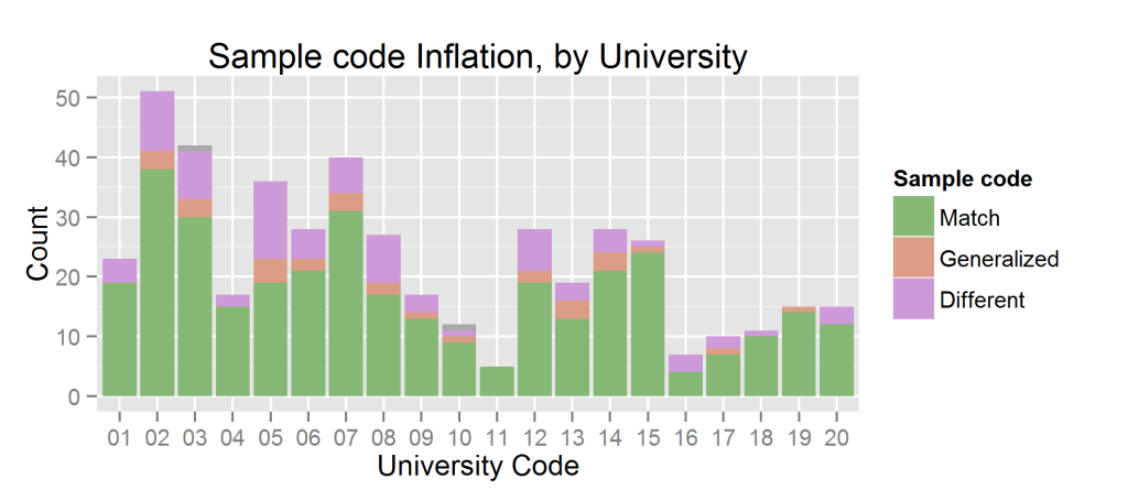
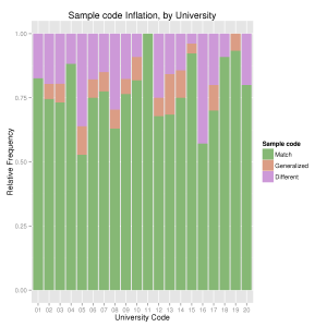
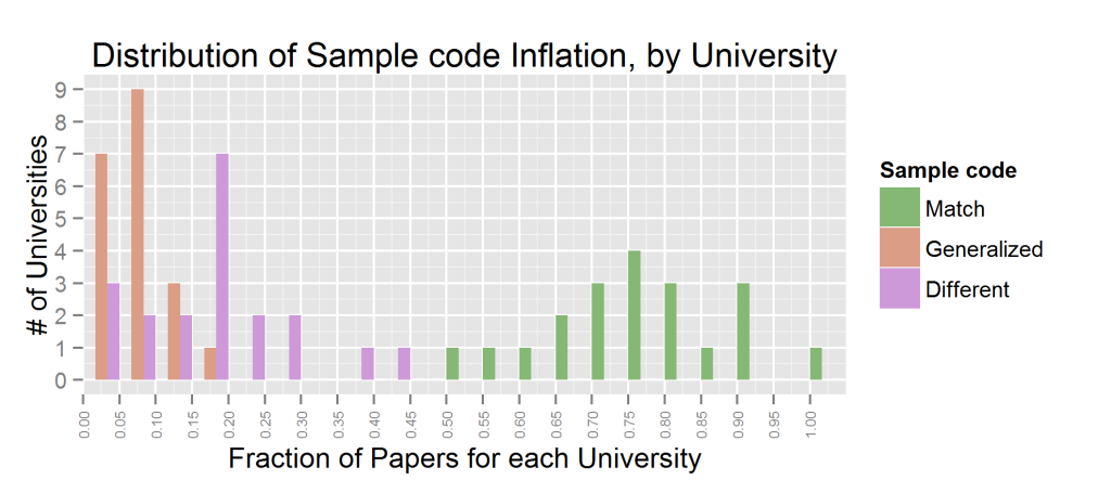
Let’s look at the statistics on sample type, aggregated by university. Below I show a stacked bar plot showing the number of press releases containing each type of exaggeration, the fraction of those papers per university, and the distribution of fractions.
Clearly the problem is widespread, most universities have at least a few press releases in which some generalizations have been made. Oddly, mild generalizations (e.g. said something was in humans when the experiment was in human cell lines) are less common than extreme ones. Universities 05 and 16 are the most egregious offenders; but those may be statistical flukes. Given 20 universities with a rough average rate of 30%, it’s not that surprising to see 2 closer to 50%. University 16 has only a few papers in the dataset, university 05 has a significant number. It would be interesting to see this experiment repeated for another year, to see how consistent these results are.
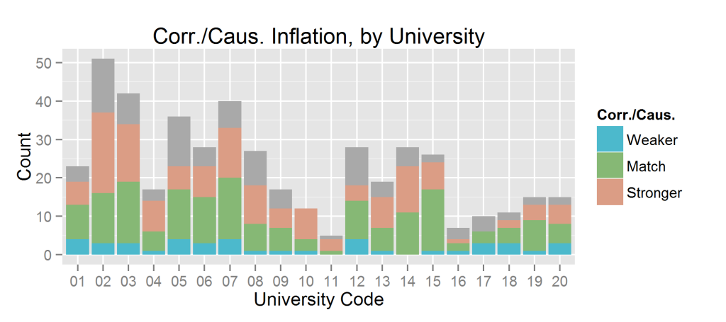
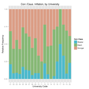
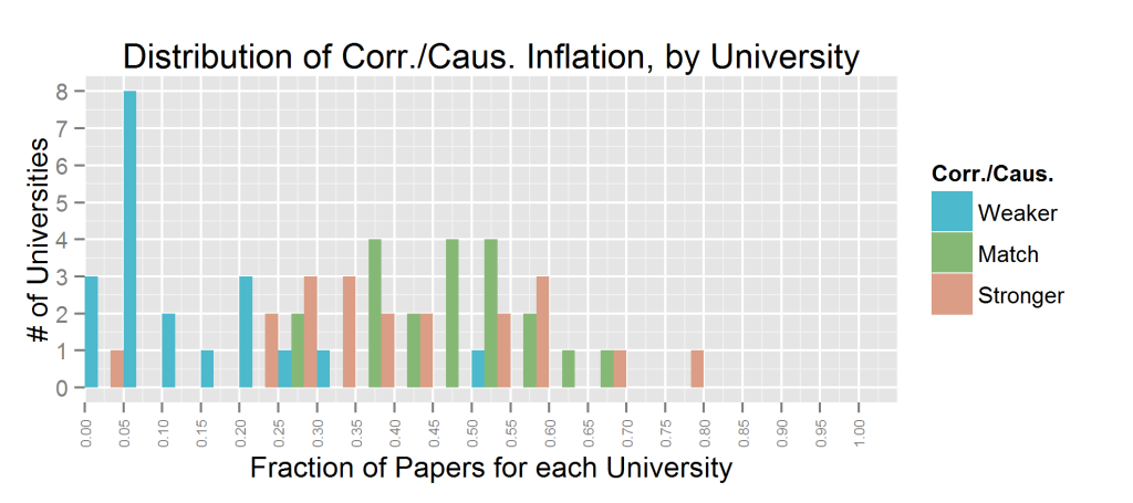
Inferring causation from correlation is much more common. Which I expected; reasonable people can disagree about when it’s appropriate to infer causation from correlation, they can’t disagree on whether an experiment was done on cell lines or live humans. Some press releases make a weaker statement about causation than the paper itself (particularly University 17), but stronger statements are the dominant trend. Typically 30-40% of the press releases from a university contained this type of exaggeration. Below are plots showing the absolute number of papers (gray = unknown), the fraction of papers (with unknown excluded), and the distribution of those fractions.
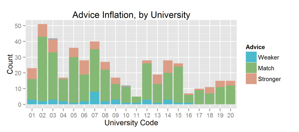
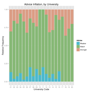
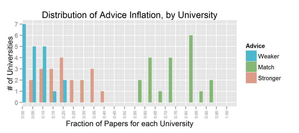
The coding for “advice” was a bit complicated, depending on the wording. I simplified the coding to stronger/match/weaker. Which just mean that the press releases contain a stronger/same/weaker form of advice than the paper. The pattern here is similar to that of causation/correlation; most universities do it occasionally. And press releases usually contain stronger claims than papers, but not always.
Goldacre’s “mischevious idea” was to name and shame authors. I’m not a big fan of shaming anybody, particularly based insufficient data. This dataset has 462 papers, and most authors are only represented once. Furthermore, press releases don’t have authors names attached (and I agree with Goldacre that this should change, but it’s not the case yet), so one can’t know who wrote what. So I’m not going to call out any authors and just look at trends.
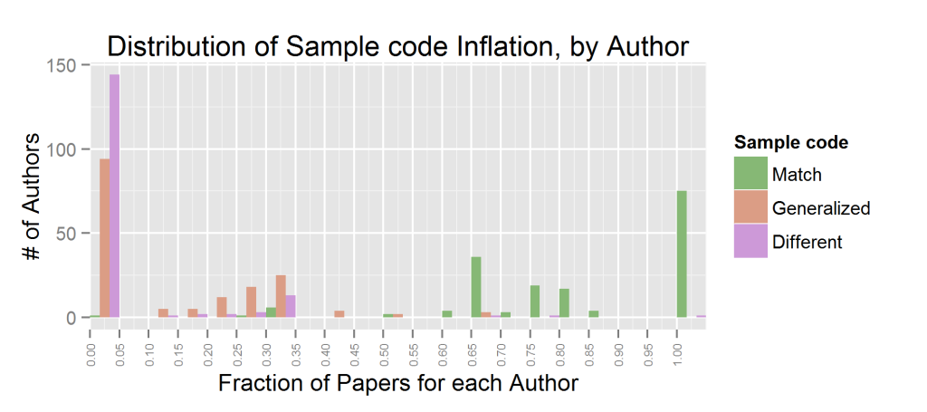
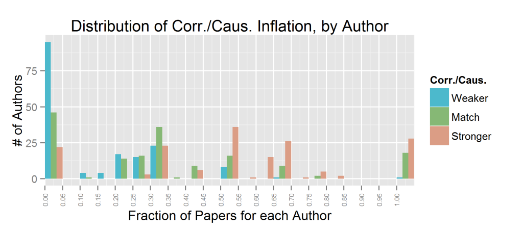
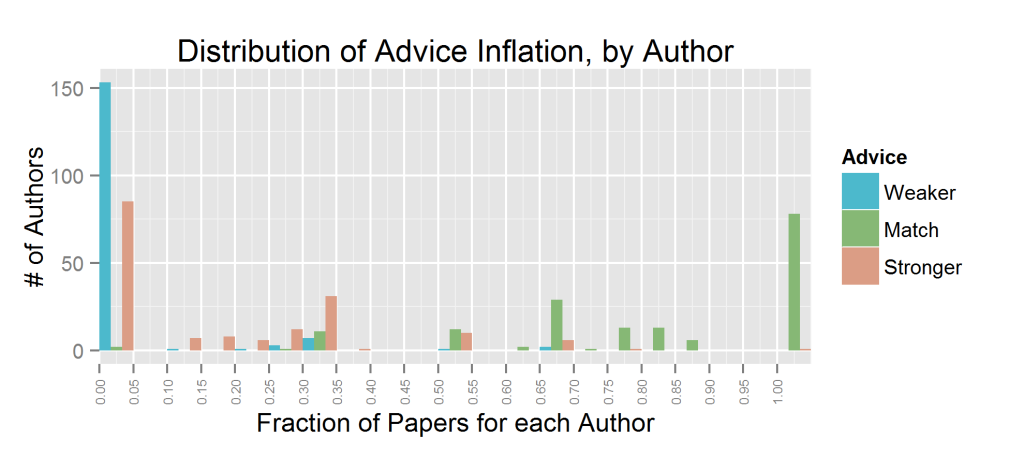
I only looked at authors with at least 3 papers in the set[3] . All authors for a paper were considered equal; I accumulated all the papers with a given authors name on them and measured the fraction of those papers with a given code. Note that this will count a paper as many times as there are relevant authors for that paper; I’m focusing on authors here (rather than papers).
There were 168 authors which fit this description. We see that sample code inflation is reasonably uncommon; roughly 50 authors had any significant number of sample generalizations in about 30% of their papers (likely 1 paper out of 3). Similar for advice inflation. Inferring causation from correlation is much more common. For most authors, at least half of their papers contain this type of exaggeration.
Conclusion
When people call something a systemic or cultural problem I feel like it’s a cop-out to avoid any personal responsibility. Nevertheless, it is unfair to single out any person or group when so many people are guilty of the same thing. What I take away from the above figures is that press releases are not a reliable source of information. There are no shortcuts here; if one cares about the findings of a study they need to read the peer-reviewed journal article itself. It would be nice if research could be made accessible to non-scientists without making biased claims along the way, but here we are.
- [1]The association between exaggeration in health related science news and academic press releases: retrospective observational study
- [2]Preventing bad reporting on health research
- [3]This has the unintentional effect of choosing highly prolific authors, but it’s impossible to measure a fraction with only one datapoint↩


Thanks for this excellent ‘peek under the bonnet’ which dissects a bit further what might be going on here! You have helpfully made your methodology very clear.
The only refinement I would suggest (especially over time – were this study to be replicated) would be to allocate weightings for order of authorship (or some variant on this).
The final author is conventionally often the departmental head, and could reasonably be assumed to have a different degree of responsibility re governance than the earlier authors, especially when there are more than say 4 authors altogether. My hypothesis would be that the ‘further to the right’ the final author was (i.e. 4th of 4, 5th of 5, 6th of 6, etc), the more prolific (and in my view, for what it’s worth, the more senior and therefore responsible for overall governance) s/he should be.
Would your dataset have enough allow this hypothesis to be tested?
I thought about weighting somehow by order but decided against it. My understanding is that the first author does most of the work, the last author is the PI, and the ordering in the middle is arbitrary (this varies by field but that’s the bio order). It’s not at all clear to me which of those people has the greatest influence on the press release, so rather than try and guess/speculate I just avoided it. And as the number of authors grows (some of these had 100-200 authors) that scheme goes out the window.
The data’s all there though, and the authors are in order, so if you want to do your own analysis I’d be interested in it.
If you wanted to test against “prolific”-ness a simple metric is H-Index. I couldn’t find a reliable public database for this though; Google Scholar is the best but they don’t allow API access.